Research visualization
Within the SACMEQ Consortium there has been great satisfaction and pride concerning the high quality of SACMEQ’s research and training programmes and the impact that SACMEQ’s research reports have had on educational policy. At the same time there is also some concern that SACMEQ’s research reports are written in a rather technical style that limits their use by a wider audience of stakeholders in education systems.
The SACMEQ National Research Coordinators have discussed this matter on several occasions and they have agreed that in order to reach this wider audience more thought needs to be given to disseminating SACMEQ research results by using attractive reporting formats that are accessible to important groups such as journalists, teachers, parents, parliamentarians, and trade unionists.
It was agreed that these kinds of publications would need to place a greater emphasis on “visualizations of research results” (for example, colourful and attractive graphs, charts, and pictures) - instead of the current approach of reporting page after page of tabulated figures.
Some experimental work in this area has already been completed by the SACMEQ Consortium – and has been well received. However, more work is required to refine these innovative approaches and to make them easier to use and interpret. Four examples of how SACMEQ has used visualizations of research results have been presented in Appendices B, C, D, and E.
Visualization of the Sources of Educational Equity
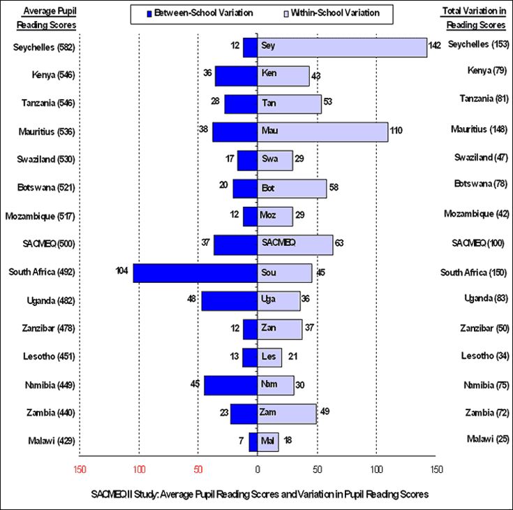
In the visualization below the concept of equity in educational achievement for the SACMEQ II project has been explored by using bar graphs (Dolata et al, 2004). In these bar graphs the overall spread (or variance) in student reading scores for each country has been shown as a bi-coloured line – with long lines representing large differences between the best and poorest readers (for example, Seychelles, Mauritius and South Africa), and vice versa (for example, Swaziland, Mozambique, Lesotho, and Malawi). For each country the line has been broken into two components: (i) the spread of student scores within schools (light blue bars), and (ii) the spread of average student scores between schools (dark blue bars).
This visualization clearly shows that it is important to identify the source of an equity problem as well as its magnitude. To illustrate, the large overall variation in student scores in the Seychelles (153) was similar to South Africa (150). However, the source of this inequity was different for the two countries. In the Seychelles it was mainly associated with differences between students within schools (142) while in South Africa it was mainly associated with differences between schools (104).
Visualization of Two Views of School System Performance
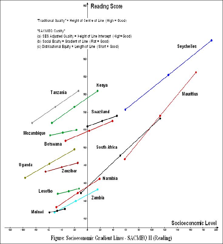
In the figure below the performance of school systems in the SACMEQ II Project with respect to the reading achievement of students is compared by using socioeconomic gradient lines in two ways: “traditional” and “alternative” (Ross and Zuze, 2004). The traditional approach assesses educational quality using the common “league table” method of comparing national average test scores – whereas the alternative approach extends the notion of quality to include adjustments for socioeconomic background and two dimensions of equity.
The traditional approach simply compares average student reading scores across countries – which is measured by the height of the centre of the lines (with Seychelles being the “best” school system). In contrast the “alternative approach” employs three comparisons:
- the difference in average reading achievement of students after adjustment for their socioeconomic background – which is measured by the height of the line intercepts with the vertical axis (with Tanzania and Kenya being among the “best” school systems in terms of adjusted quality of student reading achievement);
- the difference between the student reading levels of the better and weaker readers – which is measured by the length of lines (with Mozambique, Swaziland being among the “best” school systems in terms of distributional equity); and
- the difference between the student reading levels of students from wealthier and poorer homes – which is measured by the slope of the lines (Mozambique and Zanzibar being among the “best” school systems in terms of social equity).
Visualization of Important Sub-Groups within a Body of Data
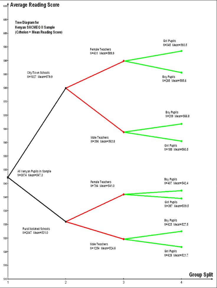
In the figure below a “tree-diagram” has been employed to examine the impact of three variables on student reading levels within the SACMEQ II Project data for Kenya. The initial overall national sample of 3074 Grade 6 Kenyan students contains 1526 boys and 1548 girls. The average reading scores for boys and girls are more or less equal (547.7 for boys and 546.9 for girls).
From this initial result we might conclude that gender is not an issue in Kenyan schools with respect to reading performance. However, if we “scratch below the surface” of this overall result by using three variables (“school location”, “teacher gender”, and “student gender”) to make binary splits in the data, we start to see some very interesting results.
The first split in the tree diagram illustrates that students in urban settings have an average reading score that is far above (around 50 score points) the average for students in rural settings. The second two splits show that in both urban and rural settings it is the students with female teachers that perform much better.
The final four splits in the tree diagram suggest an intriguing pattern – with boys performing better than girls except for the group of students in urban settings that are taught by female teachers. In this latter group the impact of student gender is reversed with girls performing better than boys. One could speculate a great deal about the reasons for this reversal – including the proposition that perhaps female teachers in urban settings provide a more positive learning environment for girls.
The main lesson of this small-scale exercise in data exploration is that education is a complex environment where seemingly uninteresting overall sample results can mask important sub-groups and difficult to explain relationships that are certainly worthy of further analysis and evaluation.
Visualization of Spatial Aspects of Education Quality
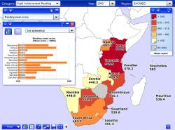
In the figures below two “screenshots” are presented to illustrate the use of the StatPlanet interactive visualization system to analyse and display SACMEQ II Project data. This experimental tool grew out of earlier developmental research conducted by Frank van Cappelle with the aim of making the contents of the SACMEQ Data Archive more accessible to a broader range of (technical and non-technical) educational planners and researchers.
StatPlanet permits researchers to “map and graph” data at national levels (as shown in the top visualization) and at regional levels within nations (as shown in the bottom visualization). The StatPlanet software is very user friendly and permits the researcher to rapidly explore options for visual presentation by making adjustments to score categories, colours, and map boundaries.
![]()
In the top visualization the student average reading scores for each country that participated in the SACMEQ II Project have first been categorized into intervals (starting with “greater than 540”, “between 540 and 510”, and so on). The thematic map has been coloured using dark red to indicate the highest category, through shades of orange, to yellow to indicate the lowest category. Note that no data were available for one SACMEQ country (Zimbabwe) and this has been indicated by grey. A quick glance at the map shows that Kenya, Tanzania, Seychelles and Mauritius have the highest average student reading scores and that Namibia, Zambia, and Malawi have the lowest. In the lower visualization an index of school resources for the SACMEQ II Project has been categorized and graphed for educational administration regions within Kenya. This particular thematic map shows the availability of a school library.